Packaging
Mahendra’s Fine Foods
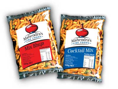
With a large range of Indian snacks, careful planning was required to ensure a consistent brand was maintained across the range, whilst retaining a point of differentiation between the individual lines for easy identification.
A selection of identifying colours were selected to differentiate the various lines. Consistent typefaces, sizes and treatments were used for the text. Part of the elements of the logo were also incorporated into the layout.